FIELD TRIP

NEW YORK Branding

Field Trip partnered with The Morris Project to refresh its brand while building on the equity of its existing identity. The goal was to create a visual language that felt familiar, collectible, and full of character.

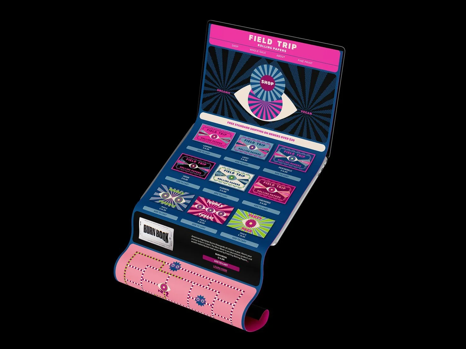
Vintage matchbooks became the foundation for the creative direction, inspiring a system of aged textures, bold graphics, and expressive typography. Centered around the Field Trip eye, the refreshed identity celebrates a nostalgic design language while giving the brand a more distinctive and memorable presence.

Brand refresh | Website | Packaging | Merchandising

Organic rolling papers, wine glass, and herbs on a table at dinner | The Morris Project
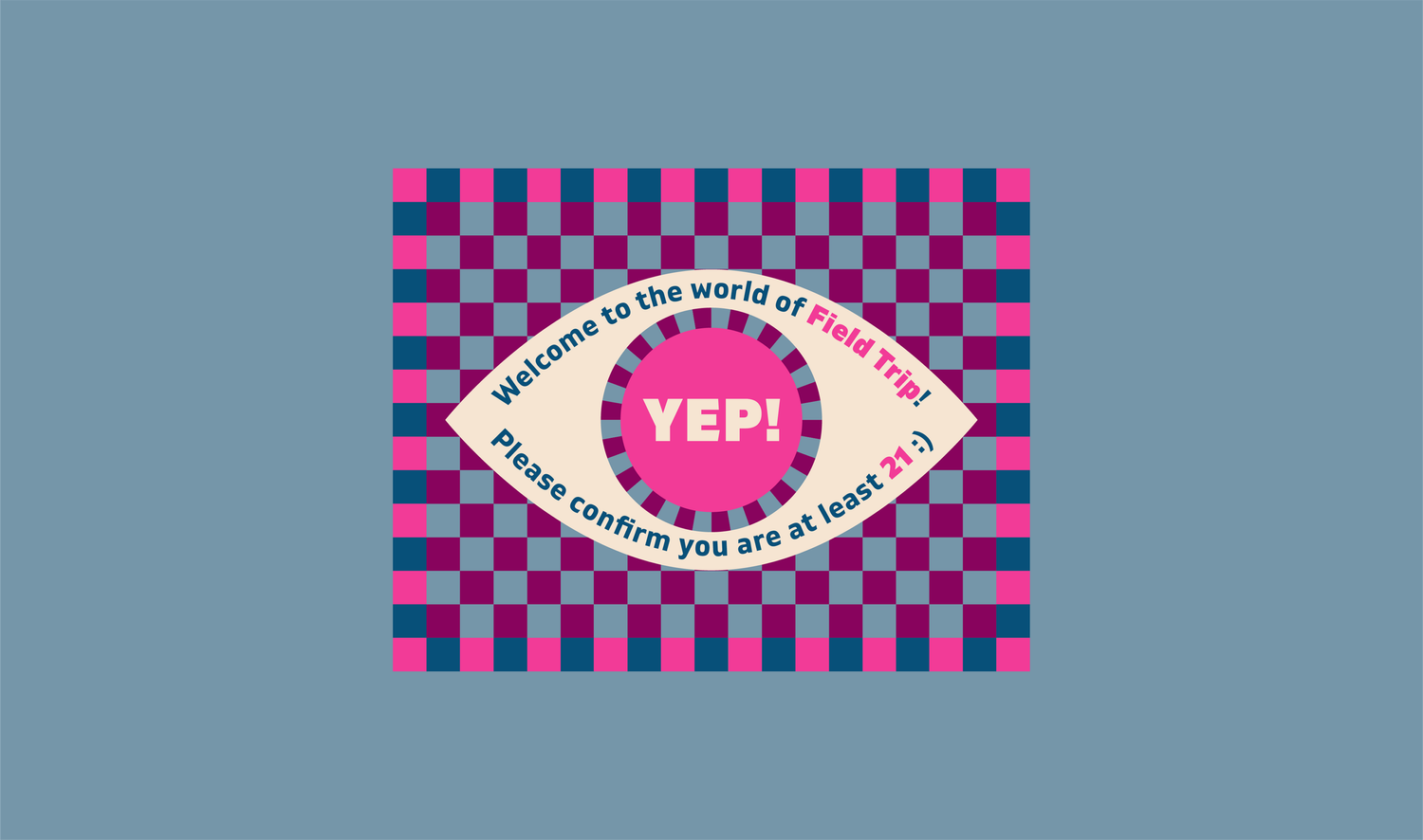
Field Trip age verification pop-up with bold eye graphic and playful colors | The Morris Project
Field Trip rolling papers with an ashtray and joint on leather surface | The Morris Project
Rolling papers and pre-rolls on a tray surrounded by herbs | The Morris Projec
Field Trip Lucky rolling papers with vibrant psychedelic designs | The Morris Project
Hand pulling colorful organic rolling paper from booklet | The Morris Project
Vibrant optical eye design with bold patterns and colors | The Morris Project
Colorful 'Don't Panic, It's Organic' rolling paper collection with bold designs | The Morris Project
Field Trip rolling papers catalog with vibrant packaging and bold graphics | The Morris Project
Relaxed outdoor scene with vibrant Field Trip eye pattern textile | The Morris Project
Black knit beanie with embroidered eye logo, pink graffiti backdrop | The Morris Project
Field Trip rolling papers with bold optical design and bright orange accents | The Morris Project
Field Trip rolling papers in Crane design, bold and colorful packaging | The Morris Project